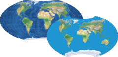
«Scaled to fit» vs. «Scaled to same width»
or: How do you compare map projections?

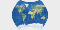
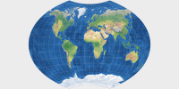
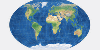
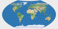
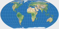
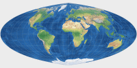
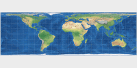
On the comparison of map projections (in Expert Mode), you can see that the images
are «scaled to fit» as well as «scaled to same width».
What does it mean?
Why is this a reasonable thing to do?
Short Answer
Map projections show different aspect
ratios. You can see that on the thumbnail images provided here:
the range is from 1:1 on Lambert’s azimutal projection
to 3.13:1 on Lambert’s cylindrical projection.
If you want to compare them, those quite different sizes have to relate to each other somehow.
«Scaled to same width» is easy to understand: In this case, both projection images
have exactly the same width (i.e about 1000 pixels here on this site).
But what about «scaled to fit»?
This means, they are scaled to fit
best into a frame of 2:1 aspect ratio – you can see that on the thumbnail images, too,
which are shown here having the aforementioned frame.
In many cases that will result in both projection images having
the same height.
On some pairings it’s more useful to compare them «scaled to fit» – on others, you will get a better impression of their differences when compared «scaled to same width». So I decided to offer both options.
And how did I come up with the idea to put the images into a frame of 2:1 aspect ratio? Well, that’s simple: that’s the way the software to generate the projection images that I was using in the beginning works. It will always export an image that looks like the thumbnails, with the projection itself centered horizontally and vertically centered and some background color to fill up the space until the resulting image has an aspect ratio of 2:1.
Later I started using other applications as well which work differently in this respect; but of course at that time, I already had lots of projection images using the 2:1 aspect ratio, so I just kept it up.
So, that’s the short answer.
If you feel that you know enough by now, you can stop reading here.
Otherwise, let’s move on to the long answer…
Long Answer
If you’re into maps, you maybe already thought that the best way to compare maps might be to use the same scale, i.e. using a scale indicator such as 1:90,000,000 or something, just like you’ve probably seen in atlases before.
There are several reasons why I didn’t do this. First of all, the above mentioned software I was using at first doesn’t offer the option to expert maps with a given scale. I can set the image size in pixels, but that’s all.
Secondly, as I’ve already explained in the Properties: Equidistant
section, the scale of a map is a purely nominal value, which is
true only for a few arbitrarily chosen distances on the map.
And that holds true for printed maps which always have the same size!
On a website there’s an additional problem:
the images here are about 1000 pixels in width.
If I hold a ruler against my screen, I
measure a width of about 26.5 cm.
On other screens, having a different screen diagonal and
a different resolution, their size measured in centimeters (or inches)
will differ. And my tablet, the images are 13.5cm to
20cm wide; depending on portrait vs. landscape mode or whether I’ve zoomed in or not.
So on map images designed for use in the web, a scale indication is folderol.
And when I started working on this website, I was satisfied with the «scaled to fit» images.
But then I stumbled across a certain pairing of map projections… namely Ginzburg V vs. Ginzburg VI.
On the scaled to fit comparison, they look like this:
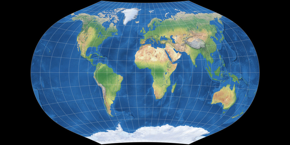
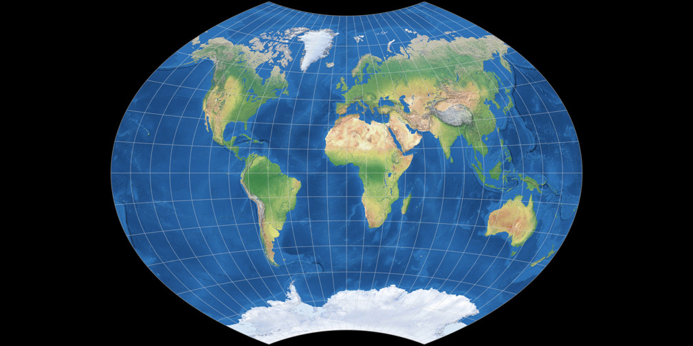
As you can see, both projections have about the same height but different width.
And then I tried what they will look like when I scale them to the same width using
an image processor:
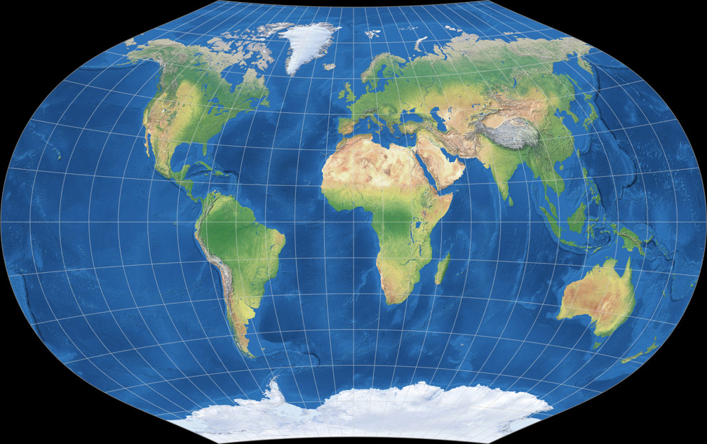
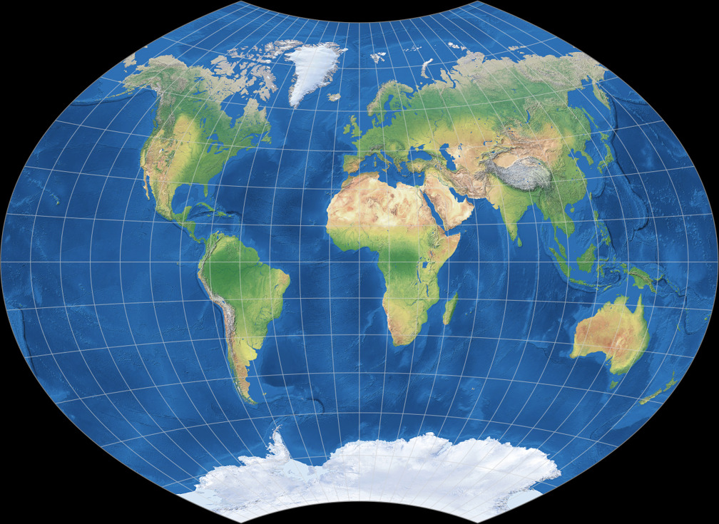
At the center – roughly between 45° N/S and 75° E/W – both maps are nearly identical!
And I guess that’s exactly what Mr. Ginzburg had in mind when he designed his projections.
On the other hand, there’s Wagner IX.
In his textbook Kartographische Netzentwürfe Wagner presented
two variants of this projection.
Firstly, he presented the formula. But then he showed a figure that deviated from the formula:
Nun kann man (…) eine weitere Verbesserung in der Verteilung der Verzerrungen erzielen, wenn man das ganze Netz in Richtung des Äquators noch ein wenig zusammendrückt. Zu diesem Zweck versieht man die x noch mit einem Faktor a < 1 (…) Die Abbildung weist eine Zusammendrückung in Richtung des Äquators auf, und zwar ist a = 0,88 gewählt.
You can obtain a better distribution of distortions if you compress the whole projection in the direction of the equator. For that purpose, you assign a factor a < 1 to the x-values. (…) The illustration shows such a compression, namely with a = 0.88.
So in this case, the scaled to fit comparison seems to better more appropriate
than the scaled to same width version.
Note: on map-projections.net, the projection according to
Wagner’s formula is called Wagner IX,
while the version according to his illustration was labeled Wagner IX.i.
(See Wagner IX vs. Wagner IX.i.)
So I asked myself, which kind of comparison should I offer on this site,
when sometimes scaled to fit is more appropriate, and sometimes
scaled to same width?
I decided that I’d have to offer both of them.
But then, the whole comparison got a bit confusing, and so I divided it into Simple and Expert Mode: the simple mode for people who just want to take a quick look, the expert mode for a more detailed analysis.
