Tissot indicatrices
Tissot indicatrix is a method to visualize the distortions of a map projection. It was introduced in 1859 by the French mathematician Nicolas Auguste Tissot.
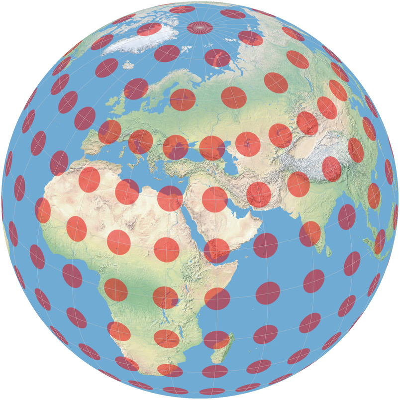
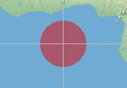
Imagine someone painting a lot of circles of identical size, at regular intervals, onto the Earth’s surface. When he’s done with it, the Earth viewed from space will look like shown in the image on the right.
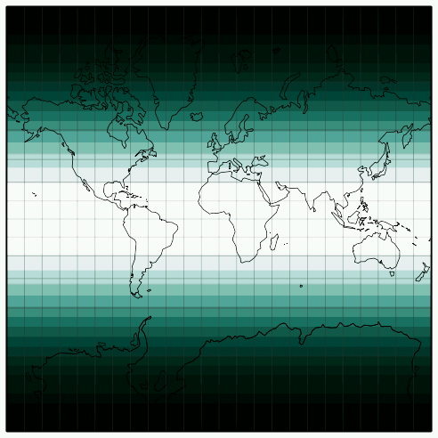
When you project the painted Earth’s surface to a flat map, the circles will be distorted. But depending on the map projection you choose, they will be distorted differently. Let’s have a look at the Mercator projection with Tissot indicatrix below:
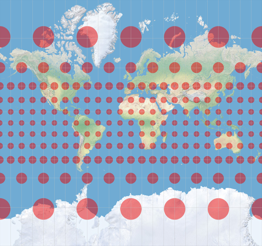
The circles kept their circular shape but grow bigger and bigger as you approach the poles.
And that’s exactly what the Mercator projection does: it keeps the shapes (locally)
but it causes different
regions on the map to have disproportionate sizes with respect to each other.
(By the way, on YouTube you can find a nice video called
Visualisierung der Mercatorprojektion
– visualization of the Mercator projection – which points out very nicely how the distortions arise.)
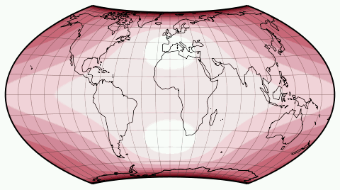
In contrast, look at the result of an equal-area projection, namely Wagner IV:
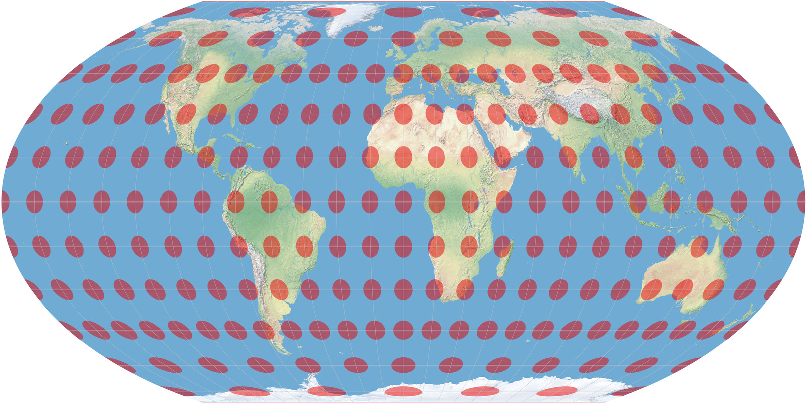
Now all the red dots kept their size –
measured in square centimeters, they all cover the same area, but alas!
Most of them have turned to ovals now!
The only dots that are close to a circle are to
be found at the junction of the central meridian
and 40° North/South – for the northern hemisphere,
that’s the dot that covers France and the north-east of Spain.
(At 42°59´ North/South it would be perfectly circular.)
And that’s what an equal-area projection does: it doesn’t distort areal relationships, but it distorts the shapes. So Tissot indicatrix is a tool to help you finding out which kind of distortion is to be found at which regions of a given map projection at a glance.
Sometimes, though, it’s not that easy to decipher the information of the Tissot indicatrix at a glance. For example on the Hammer projection:
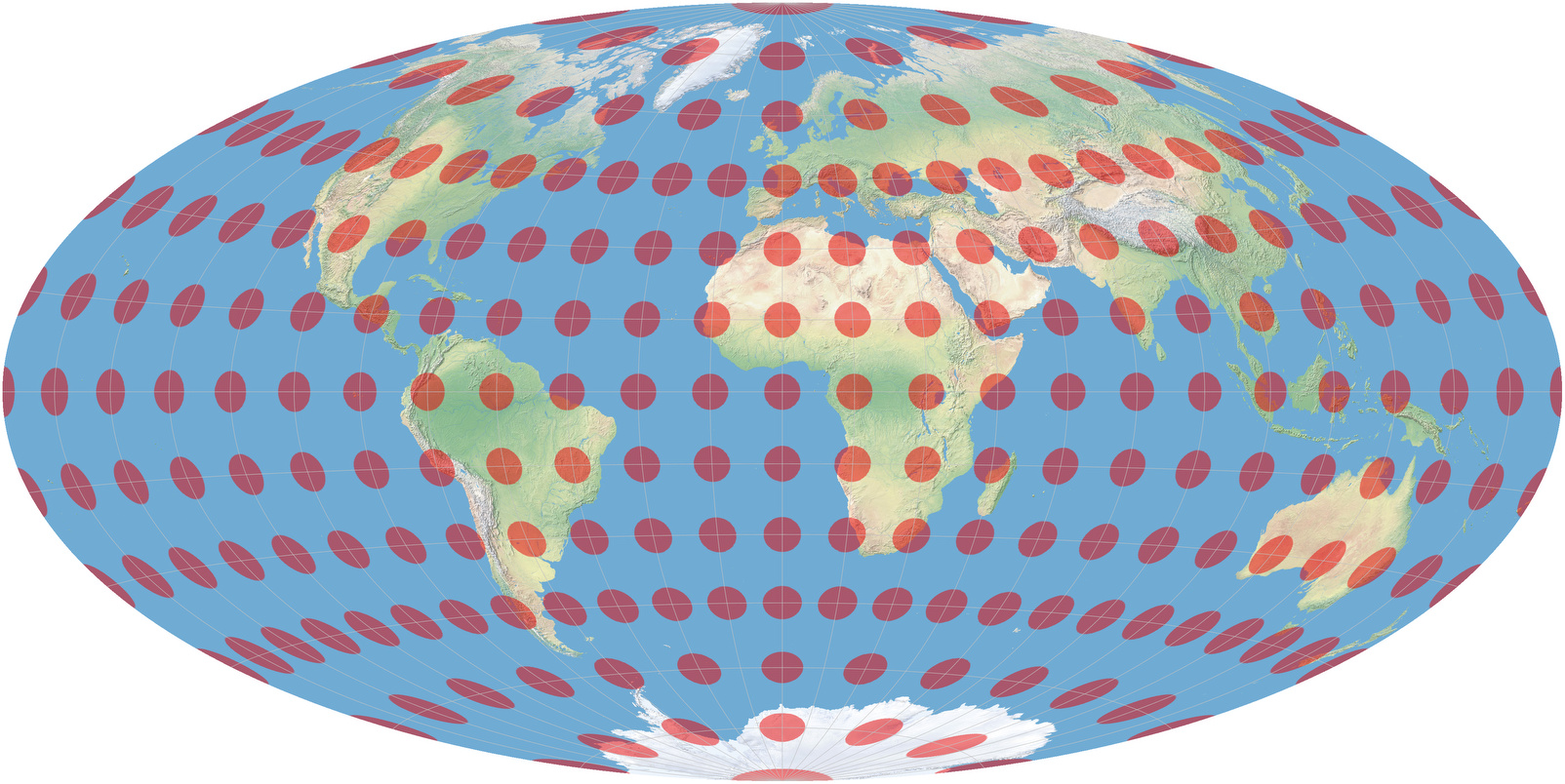
The dot is perfectly circular at the junction of equator and central meridian. But what about the one covering Alaska at 60° North, 150° West? Well, obviously, it’s quite distorted – but does it have the same size as the one mentioned before? I can’t tell by just looking at them, can you?
As long as I know that the Hammer projection in equal-area, I don’t have to tell it by looking. Because I’m aware that there are no distortions of areal relationships, so all that I’m interested in is the distortion of shapes – and then, Tissot indicatrix is helpful. But as long as I’m not aware that the Hammer projection is equal-area, the Tissot indicatrix is helpful only to a limited extent.
There are other ways to visualize the
distortions of a map projection which is better in that regard.
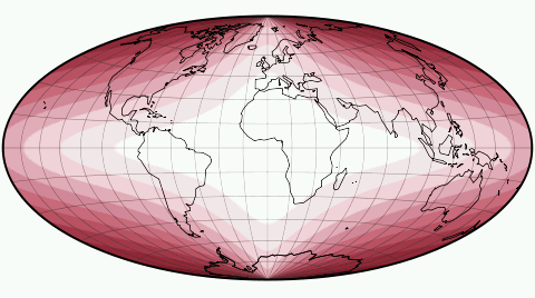
Have a look at the distortion images at mapthematics.com:
- The lighter the color, the less distortion.
- The redder, the more angular distortion.
- The greener, the more areal inflation or deflation.
Distortions of the Mercator projection
Distortions of the Wagner VII projection
Distortions of the Hammer Projection
Regrettably I can’t generate images of that kind for all projections that are included on this website. So I had to put up with the Tissot indicatrix in the comparisons section.