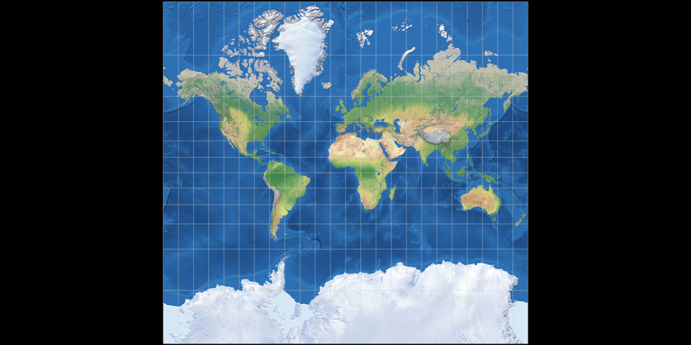
Patterson Cylindrical Projection
– Introduced 2014 by Tom Patterson, Bojan Šavrič and Bernhard Jenny.
OK, we can do this one short and sweet.
Each map projection has some kind of distortion. You can either keep the proportions of size
and will end up with severe distortions of the shapes (an equal-area projection).
Or you can try to show the shapes correctly but will end up with severe distortions of areal relationships (conformal).
Or you can balance out the distortions and create a compromise projection, which will
have both distortions of proportions and shapes, but to a lesser extent as in the aforementioned types
of projections.
Cylindric projections, which will always
produce rectangular-shaped world maps, lead to very strong distortions.
That’s why I don’t like them very much, und I do think
that in most cases, you’re better off with choosing
a different type of map projection, e.g. a
pseudocylindric or a lenticular projection.
(See Groups of map projections if you’re not familiar with these terms.)
But of course I have to admit that there are applications in which a rectangular map is helpful or even mandatory: The best example is, of course, the Mercator projection, which was the only map used in navigation for centuries.
Moreover, many people seem to want rectangular maps: Just try to find a wallpaper world map,
and you’ll see that a lot of wallpaper maps you can buy use a rectangular-shaped projection.
And regrettably, that results in the Mercator projection being seen in general use world maps for which
it simply wasn’t designed. (And that again lead to the dreadful Peters projection, but that’s a topic
that I won’t cover now…)
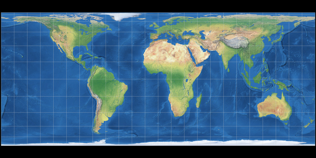
Common cylindric projections: Mercator, Behrmann, Gall-Peters, Miller 1
Uuh, I said something about short and sweet, didn’t I? – Here goes:
In 2014, Tom Patterson, Bojan Šavrič and Bernhard Jenny introduced the
Patterson Cylindrical Projection, which is based on the Miller 1 projection by Osborn Maitland Miller (1942).
They chose an approach that, to my knowledge, has never been used before:
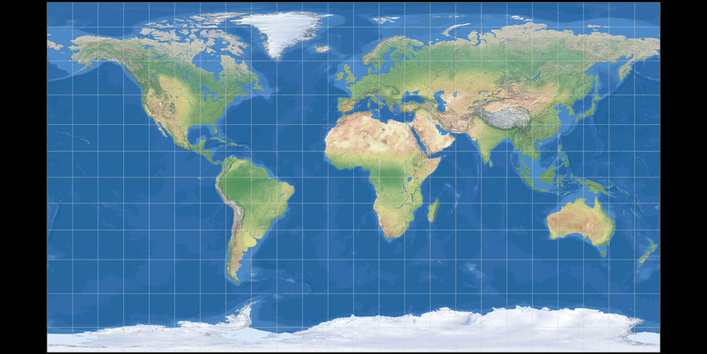
The distances between the lines of latitude steadily increase moving from the equator to 55 degrees,
level off around 60 degrees, and then decrease toward the poles. Of course, polar areas still
are shown much larger than they are: Greenland seems to be larger than
Australia, while in reality, Australia is about three and a half times bigger than Greenland.
Nonetheless, in my opinion the procedure leads results in the best cylindrical
compromise projection that has been developed
so far:
Usage
Note: I’m no cartographer. The recommendations below are made by a complete layman!
Did I mention that I’m not a big fan of cylindric projections? Oh yes, I did.
So my first recommendation is: Verify if you really need a rectangular map or if a different
shape might fit the purpose of the map better. So in case you really need a cylindric map –
let’s see how Patterson works out for different kinds of maps…
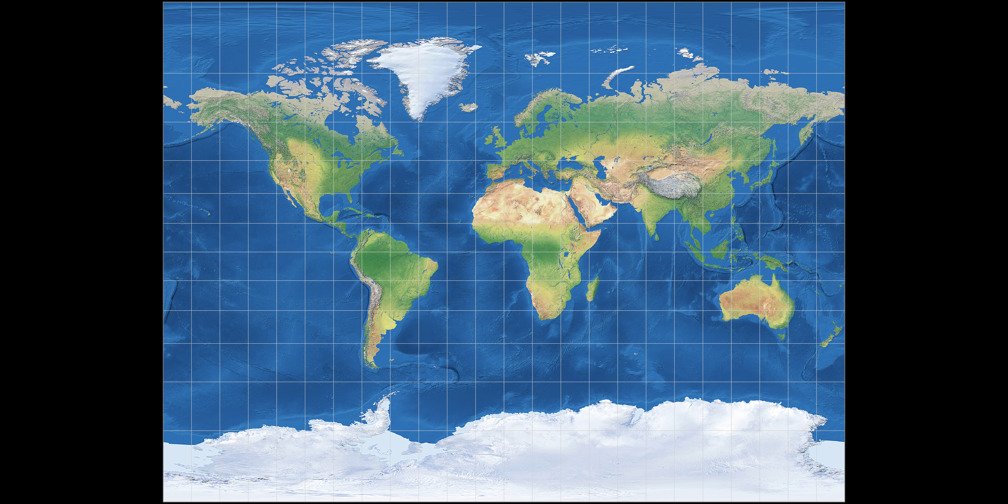
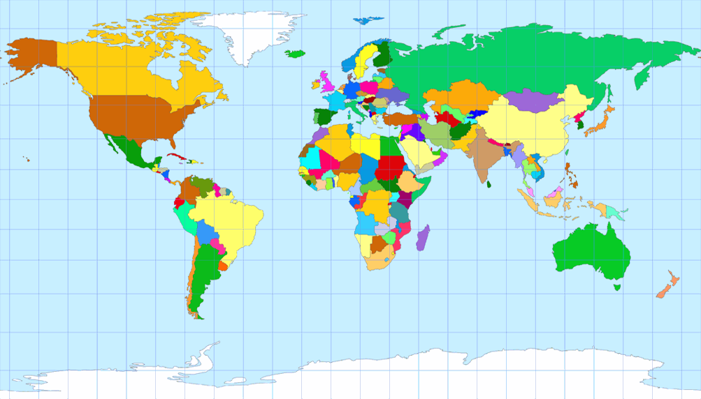
Political Map
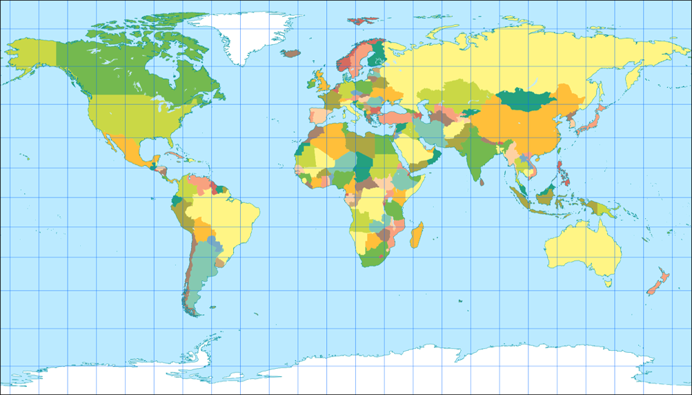
The Patterson project works quite well for an political map.
Of course, the downside is that Europe is in an area of the map which gets significantly exaggerated, so using
it you might risk being accused of eurocentrism…
Don’t say I didn’t warn you!
Topographic Map
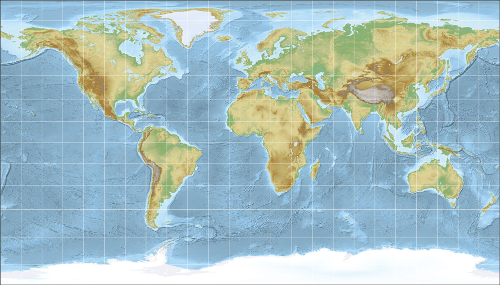
Well… my opinion:
If there’s a single kind of map which really doesn’t work with cylindric projections, it’s the
topographic map. I can’t even tell why I think so… it just feels wrong to me.
But at least the Patterson projection is better for
topographic maps than the other cylindric projections provided above.
Climatic Map
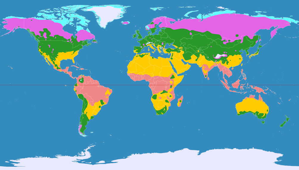
In my opinion, a climatic map is not an advisable application for the Patterson projection.
After all, the climate zones are related to the latitudes: As a rule of thumb, you can say that it gets colder
the farther you move away from the equator – but I guess, you already knew that. ;-)
The varying distances of the lines of latitude, which are great for a better display of the shapes, now are
more of a hindrance than a help. Especially regarding the fact that climate maps are often shown
without a graticule (that’s why I omitted it in in the image).
So, better use a different projection here. In case you like the aspect ratio of the Patterson projection,
try the Equirectangular projection with the standard parallels set to 35.6 degree. Or hey, here’s an idea:
Try not using a cylindrical projection! ;-)
Other thematic maps
There’s a hell of a lot of thematic maps – after all, you can stuff about any kind of statistic data
into a world map. So it’s bold to try to recommend any world map projection for all these thematic maps.
And so, I won’t do this.
Nonetheless I think that in many cases it’s not that important for thematic maps to keep certain metric properties such as equivalence or conformity. Moreover, resulting in a rectangular-shaped map, cylindric projection might fight quite well into reports, or atlases (where often a bunch of thematic maps are shown consecutively on a few pages).
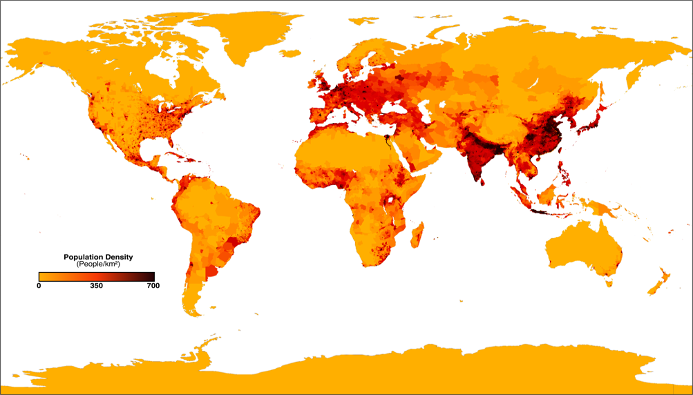
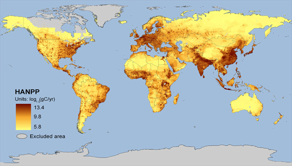
But sometimes, equivalence is important! For example, the population density is misrepresented on an map that’s not equal-area. Therefore, I think that the Patterson Cylindrical is an inappropriate projections for maps like this.
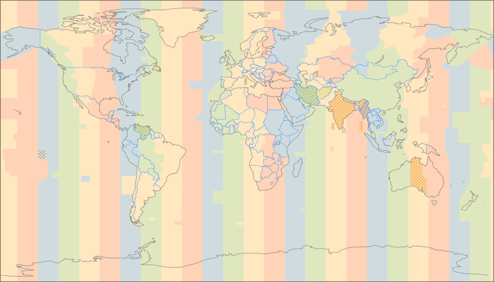
On the other hand, the time zones map is a very good example for maps that benefit from cylindric projections: Just like the climate zones are related to the latitudes, time zones are closely related to longitudes, so it might be a good a idea to use straight lines of longitude when you drop the graticule (which you should do on a time zones map since it’d add confusion).
Before I’m starting to bore you, let’s
finish quickly with two more examples, that benefit from the Patterson
cylindrical projection:
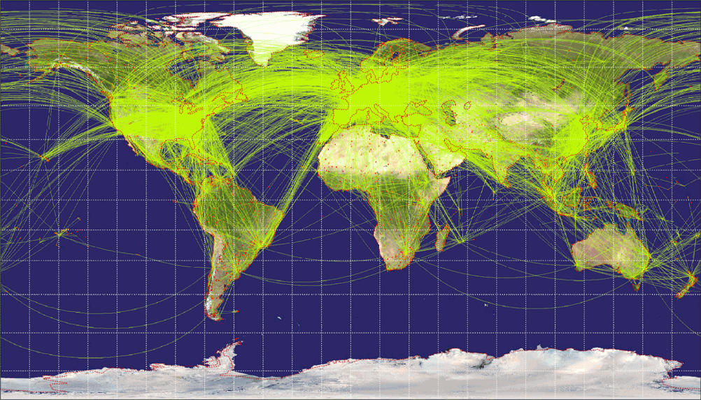
On the airline traffic map, it’s convenient that some
areas having large volume of traffic (i.e. the traffic between Europe
and North America)
are enlarged so the lines won’t blur into each other
more than they already do.
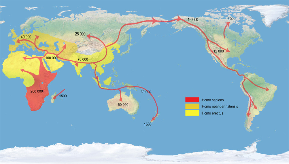
And the »Early Human Migrations« map shows an advantage
that is of course inherent in all cylindric projections: It doesn’t
matter if you
shift the central meridian (to 160° East in the image),
the shape of the continents doesn’t change.
Decorative Element
Sometimes maps don’t need to transport
information of any kind but are used as a purely decorative element.
In this cases, the maps are often shown without
graticule or neatlines (the outer borders), Antartica gets cut off, and
mostly
there is some kind of color gradient and shadow cast.
Many news programs use these maps as background image.
I’m no graphic designer, so please excuse that my own attempt of a decorative map might look a bit clumsy…

Since a decorative map often dismisses
visual guides such as graticule and neatlines, the use of a cylindric
projection
seems to commend itself.
Indeed I think the Patterson Cylindrical projection
looks great for this purpose, definitely better than the
projections used by the two most important german news
programs (which are, I think, Miller 1 and Braun stereographic).
So I do hope that Pattersons projection will be used for decorative maps a lot!
Conclusion
The Patterson projection is a very good cylindrical which should be considered whenever you need a rectangular map. It still exaggerates the polar areas but to a lesser degree than comparable projections, and preserves shapes of the land masses very well.
And, as a side note, when you really need an equal-area map, don’t choose a cylindric projection…
Remark
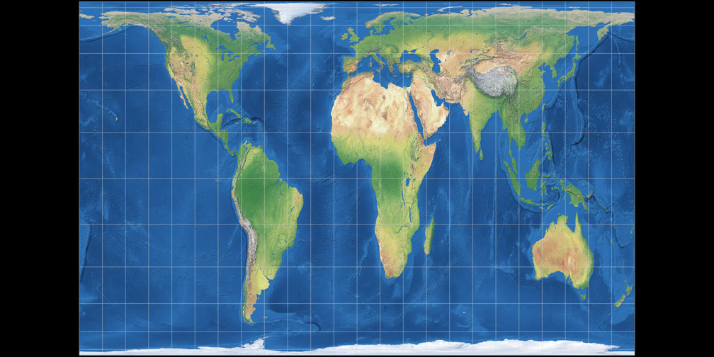
Patterson, Šavrič and Jenny developed another projection, the Compact Miller. It’s an intermediate production step which reduces the area of polar regions compared to the original Miller 1 but to a lesser degree than the Patterson projection does.
Recommended Comparisions
- Miller 1 vs. Compact Miller
- Miller 1 vs. Patterson
- Compact Miller vs. Patterson
- Braun Stereographic vs. Patterson
- Equirectangular Projection (standard parallels on 35.6°) vs. Patterson
- Mercator vs. Patterson
- Gall-Peters vs. Patterson
- Behrmann vs. Patterson
Links
- Introducing
the Patterson Cylindrical Projection
- World Political Map
A free, editable, beautiful and very large world map, which is available in Pattersons Cylindrical Projection (and in Natural Earth and Natural Earth II as well).
Update
The article was updated on June 4, 2016. Changes include:
-
The political map image was replaced by a new one which I liked better.
The old image is still available. - The population density map image was added and replaced the previously used net primary production (NPP) map image. The NPP map image is still available.
- New examples: Airline traffic and timezones map images.