What’s this all about?
When I got interested in map projections, I conceived the desire to compare them directly.
I’ll elaborate on this in a moment, but for reasons that’ll become
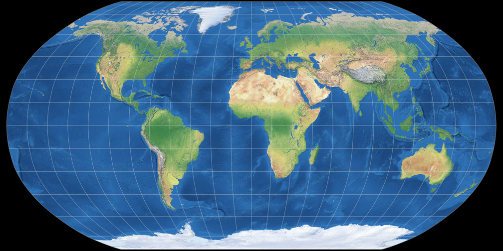
obvious later, let’s have a look at the Robinson projection first.

When I was skimming through a book an map projections, every once in a while I felt that two different projections weren’t so different after all – in fact, I asked myself: «Aren’t they identical?» I turned the pages back and forth, back and forth; but I couldn’t spot the differences. That short moment of turning the pages was enough to thwart the plan to compare them directly.
The same thing happened when I was looking at map projections on the web… that was even worse: Not only I had to switch between browser tabs but also the projection images were of different size or using different imagery.
So one day when I failed to see the distinctions of two projections, I downloaded both images, scaled them to the same size in an image editor, layered them on top of each other, giving the one on top an opacity of 50%.
I was stunned.
The differences that I failed to see before were so
obvious in an instant that wondered how it’s even possible to miss them!
In the weeks that followed, I repeated the procedure each time when I found two projections that looks quite similar – or, when the differences were obvious in fact but I wanted to compare them in detail. And after some time I was fed up with repeating this over and over. I thought it might be convenient if I had a bunch of images that all are of the same dimensions and imagery.
So I installed the G.Projector software, picked
Tom Patterson’s Natural Earth II
as input image and started a small collection of projection images.
Then, I wrote a website for my own personal use,
containing the scripts needed to layer and toggle the images. And since I
couldn’t decide whether to use physical maps that toggle on mouse click
or superimposed, semi-transparent silhouette maps, I just decided to use both. ;-)
And later, namely when I compared Wagner IX to Winkel Tripel, I felt the need to compare the distribution of distortions, and I added the Tissot indicatrix images. About that time I thought that I maybe should release the website to the public: Maybe from time to time it might be useful to someone who is interested in map projections.
But now, I’ve got to approach another topic.
Let me quote Karlheinz Wagner from the preface of his book
Kartographische Netzentwürfe (1949), which is, in my understanding,
a kind of standard work among german cartographers:
[Es] sei noch einmal grundsätzlich gesagt, dass es das so oft gewünschte Buch über Kartenentwürfe ohne Mathematik nie geben kann. Das wäre dasselbe, als wenn man ohne Instrument Klavierspielen lernen wollte.
In English:
In principle it has to be said that there never can be the often desired book about map projections without mathematics. That would be the same as if you wanted to learn to play the piano without the instrument.
And here I am, publishing a website about map projections – without mathematics.
Was Wagner wrong?
No, of course not!
If you really want to learn something about map projections,
you have to know the mathematics.
But to stick to Wagner’s example: You can enjoy piano
music, you can learn to distinguish the different musical genres or even
different styles of playing the piano, without ever
touching the ivories yourself.
And that’s what this website is all about:
Getting to know the different kinds of map projections.
Learning to distinguish the differences.
But also, to enjoy map projections.
After all, I didn’t decide to use the beautiful Natural Earth
depiction of the earth as source for
the graphics for nothing, although a simple schematic
design might have been sufficient to show the differences.
So you won’t learn anything about the mathematics of map projections here on this site.
I’ve got to admin that my own knowledge of math is much too limited to write
about that kind of stuff.
If you’re keen to learn about the mathematics of map projections,
head over to the Links section.
But now, I’d like to come back to the two
projections I mentioned in the beginning. Those that I fail to distinguish in the book.
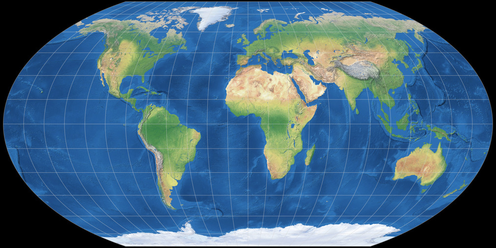
One of them was the Robinson projection that I showed
above, the other one was Wagner V which is shown below.
Please scroll up and down, and maybe you’ll find it hard to see the differences, too.
And them, when you’ve tried that a few times, follow the Link to the direct comparison
of the two projections.
I think – and I hope – that you’ll agree that there, the differences are much easier to see.
And basically, that’s what this is all about.
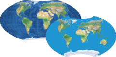
Compare Wagner V with Robinson

